2/20/24
Looking back, before charging forward
When Holocene got started, two guiding themes were abundantly clear:
- Technology – we had conviction around a technical approach to direct air capture (DAC) – namely, a liquid + low temperature + thermochemical system – that we believed had the highest potential to turn lofty DAC dreams into a reality.
- Inspiration – we knew the name of the company would be Holocene, serving as a nod to the Holocene Epoch and our mission to play a role in restoring the climate stability seen over the ~12,000 years prior to the industrial revolution.
Beyond that, we needed a landing page to convince a few scrappy and ultra-talented technologists to join us. But needless to say, a refined brand or dynamic website was on our long list of future problems we would be grateful to one day have.
Over the past 2 years, we’ve been fortunate to build Holocene into a company that is ready for a brand identity that can serve as our visual foundation for years to come.
Here’s the story of how it all came together.
What were we solving for?
When we kicked off the effort, we started with 3 guiding principles:
- “Everything but the name” – we were open to evolving every piece of our brand identity… besides the name. The name is too core, and connected, to our mission to be changed – a non-negotiable.
- Tone & Personality – we wanted our brand identity to represent a tone and personality that is (a) ambitious, but reliable (b) technical, but approachable, and (c) inspiring + distinctive
- Logo & Identity – lastly, we knew we needed a new logomark, or icon, as we did not have one. And we wanted the entire brand, starting with the logo, to be unique from our peers (many employ circular marks and mountainous imagery)
Introducing our new brand identity – fluidity meets form.
These constraints, alongside a great deal of creativity and brainstorming, led us to a central brand concept that we knew hit the bullseye.
Fluidity meets form.
This concept directly mirrors and represents our two guiding themes:
- Technology: our technology combines form (e.g., structured packing) and fluids (e.g., air, water) to transfer CO2 throughout our system.
- Inspiration: the Earth and its climate exist at the intersection of highly fluid and dynamic regimes, married with deeply structured and predictable behaviors. You will find this concept, fluidity meets form, in each of the below brand pillars.
New logo and marks
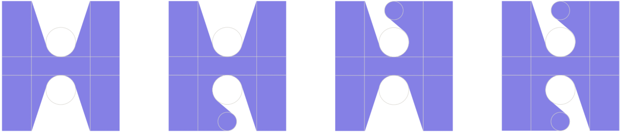
Our new logo is a bold, and distinguishable “H”… but it is also an “H” that was created with a great deal of structure behind it.
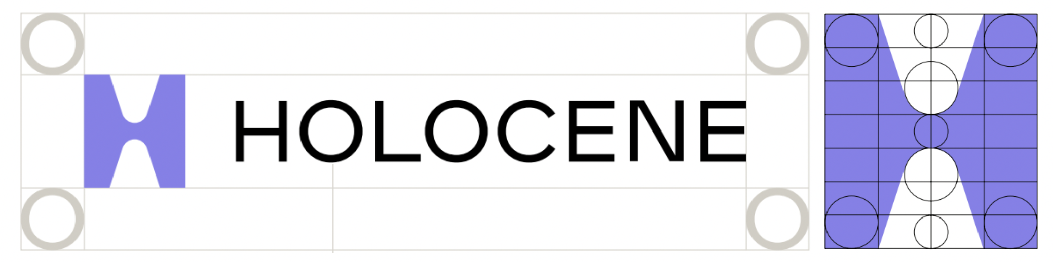
Logo and mark embodiments
This structure, or form, is what enables the fluidity that you see in our logomark embodiments. We call it a “morphing H”, but it is a logomark embodiment that is threaded across our entire brand identity.
Starting with the first moment that you reach our home page.
Reimagined photography and uses
The photography we showcase largely embodies the fluidity within our brand – captivating images of liquids in motion, connected to nature.
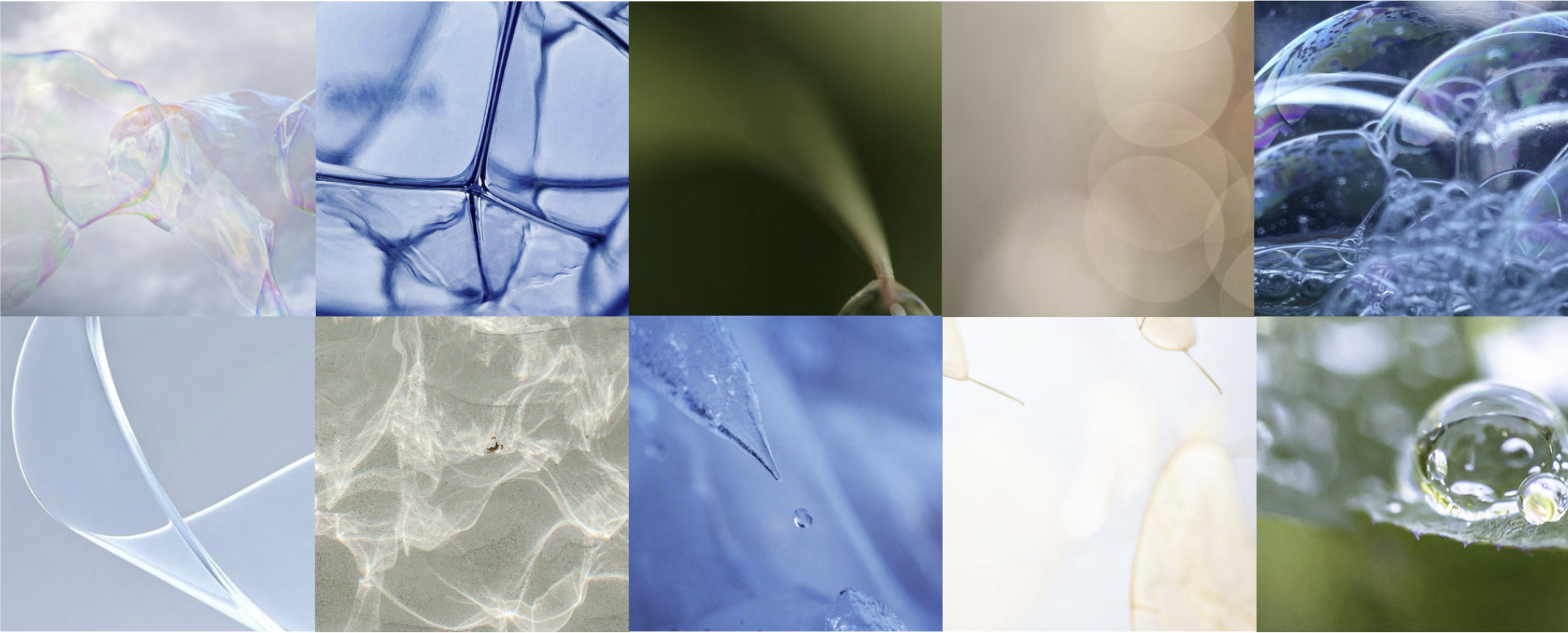
We then embed form alongside these images as our logomark and its embodiments serve to shape and complement the imagery.


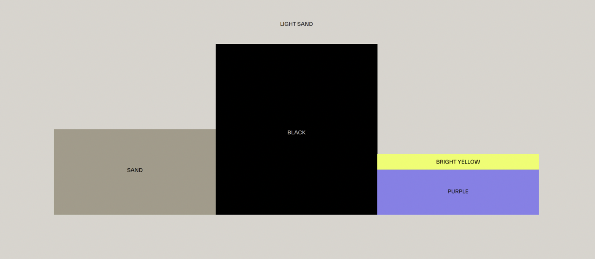
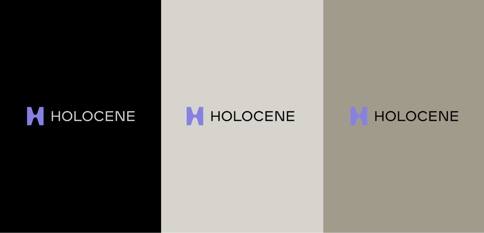
An evolved color palette
The color palette that ties it all together draws from earth-inspired sand tones, while embedding dynamic notes of color (purple, neon yellows), and grounding itself in the black background that we know and love.
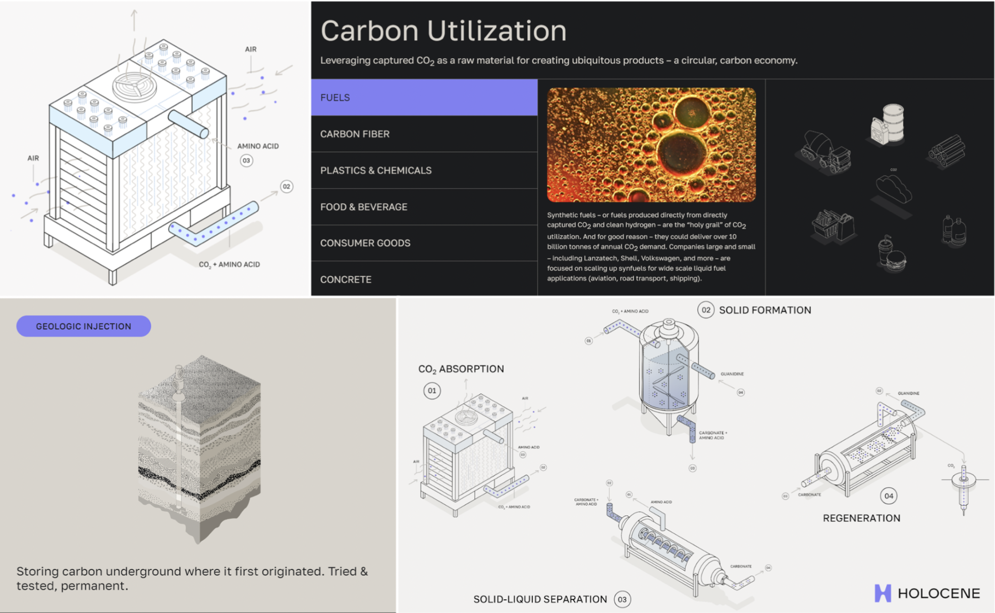
Fresh technology graphics
If that wasn’t enough, we knew a rebrand alone was not the point.
This effort gave us an opportunity to help the outside world understand how our technology (both the capture, and sequestration) works… in a way that represented our brand tone & personality: inspiring, reliable, and approachable.
Shoutouts
We could not have done this without the brilliant and hardworking folks at Draft along with their network of partners that complete their offering.
Draft has quickly become a top choice for early & exciting climate-tech companies looking for a new identity (Sightline, Conduit, Mantel, and more) and we couldn’t recommend them more.
We also couldn’t have processed the 1000s of decisions needed without the help of our friends, family, and peers who helped guide us along the way. (you know who you are!)
We’d also like to thank Isabel Sutton, who served as the voice artist for the transcript behind our refreshed technology graphics.
Parting reflections
We are deeply proud of this evolved brand identity, and excited to see where it can lead us. But more than anything, we hope this brand, and this blog post, is notable not because of its beauty but because of what the team of hard-working Holoceners can create behind it.
We’re excited to share more about our progress in the coming months.
Give us a follow on LinkedIn or sign up for our newsletter to be the first to hear what’s next.